Larta Institute
Brand Refresh
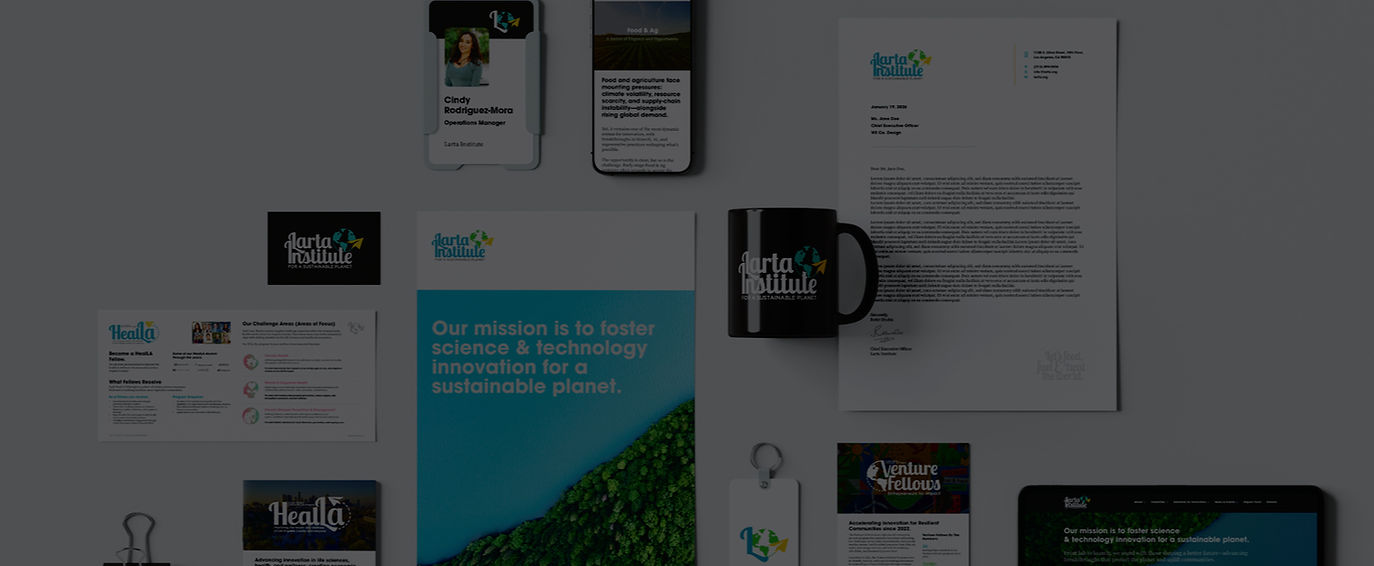
A reimagining of Larta's visual identity with a focus on personality, flexibility, and scalability. The goal was to create a fresh, engaging mark that could work across digital platforms, social media, events, and program-specific initiatives while reflecting Larta’s global, innovative mission.
I developed a new logo featuring the words “Larta Institute” in a flowing, script-inspired typeface, paired with a globe and a paper airplane orbiting around it—introducing movement, energy, and a sense of connection to the world.


Key Highlights:
-
Introduced a dynamic, expressive logo that communicates innovation, reach, and forward motion.
-
Built a modular identity system with adaptable typography, iconography, and color palette for diverse applications.
-
Focused on scalability and clarity for both digital and physical contexts, including social media, event branding, and program-specific initiatives.
-
Explored playful visual elements (paper airplane, globe) to inject personality while maintaining professional cohesion.
This project was self-directed and represents a design exploration, not an official re-brand.
More Branding Projects
Take a look at some more of the branding projects that I've worked on. From brand new brand identities to mini brand guides and rebrands, I work with all kinds of people and businesses to bring their visions to life.