Elevating Emulate
Brand Energy and Technical Precision
Emulate needed a designer to bring clarity and cohesion to a wide range of printed materials—from technical protocols to instruction manuals—while maintaining a modern, innovative brand presence. The challenge was transforming complex scientific information into intuitive, approachable designs without sacrificing precision or usability.
As Emulate’s graphic designer, I focused on creating systems that balanced function and storytelling. Through thoughtful layout design, technical illustration, and visual consistency, I helped ensure that every touchpoint was clear, usable, and aligned with Emulate’s forward-thinking identity.
Explore selected work below.
Creating Clarity Through Layout and Illustration
Technical Documentation & Visual Systems
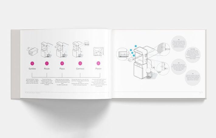
When I joined Emulate, much of my work centered on improving the structure and readability of lengthy protocols and instruction manuals. These documents needed to be easy to navigate and quick to understand in lab environments.
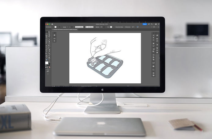
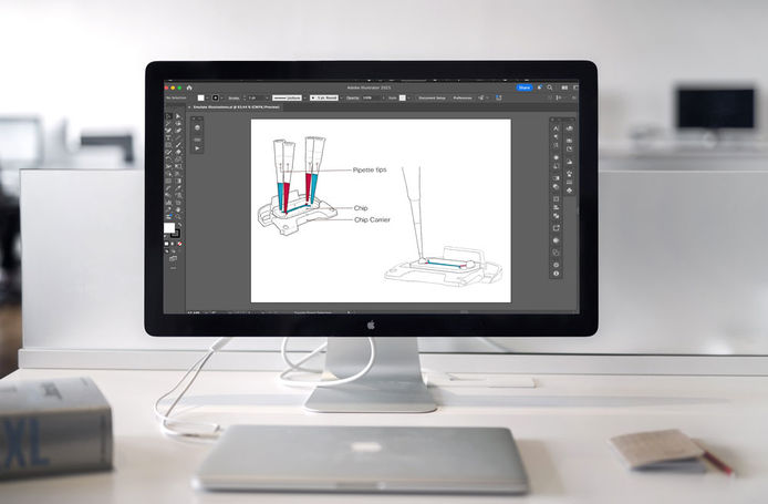
Originally, the materials relied on photography to illustrate procedural steps. I proposed shifting to custom line illustrations as a cleaner, more flexible solution. Once implemented, these drawings became a core visual element across Emulate’s documentation—improving clarity, enhancing comprehension, and elevating the overall presentation.
The illustration system extended beyond manuals and into product packaging and supporting materials, helping establish a cohesive and professional visual language across the brand.
Capturing Brand Energy Beyond the Lab
Photography & Brand Expression
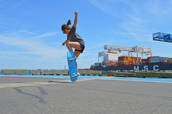
These photographs were created to showcase Emulate-branded skateboards as a playful expression of the company’s culture and innovative spirit. While the shop page was ultimately not launched, the project offered an opportunity to explore the brand in a more expressive, human way—capturing motion, energy, and personality outside of a traditional lab setting.


